![]()

Learning objectives
In this lecture we will have a look at dimensionality reduction and data visualisation. When we look at the feature vector of a dataset it can contain many features and each feature corresponds to its own dimension. In the first part of the notebook we will explore a method to reduce the dimensionality of a dataset. In the second part we will look at a an algorithm to extract information from high-dimensional data and display its structure in two dimensions. Both these methods fall into the cateogory of unsupersvised algorithms. The learning objectives are to be able to answer the following questions:
- What is dimensionality reduction?
- When is dimensionality reduction useful?
- What is topology and how is it connected to Mapper?
- What are the steps involved in Mapper?
References
- Chapter 8: Dimensionality Reduction, Section PCA of Hands-On Machine Learning with Scikit-Learn and TensorFlow by Aurèlien Geron
- Santa2Graph: visualize high dimensional data with Giotto Mapper
Homework
As homework read the references, work carefully through the notebook and solve the exercises. This lecture covers several complex topics and it is important that you familiarise yourself by experimenting with the notebook.
Part 1: Principal component analysis
First we have a look at a method to reduce the dimensions of a dataset. There are two main reasons why we would like to reduce the dimensionality of such datasets:
- Some machine learning algorithms struggle with high dimensional data.
- It is hard to visualize high dimensional data. In practice it is hard to visualise datasets that have more than two or three dimensions.
There is one very common approach to reduce the dimensionality of data: principal component analysis (PCA). The idea is that not all axis contain the same amount of variance and that there are even combination of axis that contain most variance. PCA seeks to find new coordinate axis such that the variance along the axis is maximised and ordered (the first principal component conatains most variance).

Figure: PCA can look intimidating at the beginning.
# dalineplotrangling
import pandas as pd
import numpy as np
from dslectures.core import get_dataset, convert_strings_to_categories, rmse, fill_missing_values_with_median
from pathlib import Path
from tqdm import tqdm

# data viz
import matplotlib.pyplot as plt
import matplotlib as mpl
import matplotlib.image as mpimg
import seaborn as sns

sns.set(color_codes=True)
sns.set_palette(sns.color_palette("muted"))

# ml magic
from sklearn.model_selection import train_test_split
from sklearn.ensemble import RandomForestRegressor
from sklearn.metrics import r2_score
from sklearn.preprocessing import StandardScaler
from sklearn.decomposition import PCA
from sklearn.model_selection import cross_validate

#dslecture
from dslectures.core import rmse
# uncomment if running on Binder / your laptop
# !pip install --upgrade dslectures
get_dataset('housing_processed.csv')
data_path = Path('../data/')
housing_data = pd.read_csv(data_path/'housing_processed.csv')
housing_data.head()
housing_data.shape
housing_data.describe()
We drop the two columns that contain categorical data with many categories. We could create extra columns for each categoriy but since there are many of them that would create a lot of extra features.
housing_data.drop(['city', 'postal_code'], axis=1, inplace=True)
Then we split the data into features and labels as usual:
X = housing_data.drop('median_house_value', axis=1)
y = housing_data['median_house_value']
feature_labels = X.columns
rf = RandomForestRegressor(n_estimators=100, max_features='sqrt', n_jobs=-1, random_state=42)

results = cross_validate(rf, X, y,
                         cv=5,
                         return_train_score=True,
                         scoring='neg_root_mean_squared_error')
rmse_full = -np.mean(results["test_score"])
We get an RMSE of roughly 60'000:
print(f'RMSE: {rmse_full}')
Standardisation
PCA works by finding new axes in the dataset that cover the most variance. Since variance is the average squared distance of each sample to the sample mean this depends on the scale of the feature. To illustrate this think of two columns that contain the height of the person measured in centimeter and meter. Although height described in these two columns are the same the variance will be 10'000 times larger in the centimeter column (100^2) and the standard deviation 100 times larger.
rand_values = np.random.randn(1000)
rand_values.var()
(100*rand_values).var()
For this reason it is important to scale the features such that they are comparable to each other. A common approach to do this is to transform the data such that the mean is zero and the standard deviation is one. The following formula achieves this:
$x_{std}=\frac{x_{old}-\mu}{\sigma}$
Scikit-learn provides a function to do this for us called StandardScaler. We can do this in one line with the function .fit_transform(). Similar to the function fit_predict() it combines the process of fitting which means calculating the mean and standard deviation of the dataset and then transforming the data by applying the above described formula.
X_std = StandardScaler().fit_transform(X)
X_std.shape
We can see that the mean is zero (or close enough) and the standard deviation is one:
X_std.mean(axis=0)
X_std.std(axis=0)
Now we apply principal component analysis to the standardised features. After initialising a PCA object we can use the .fit_transform() to find the principal components and then transform the dataset into these new coordinates.
fit_transform the test set. Use it on the training set and apply the mean and standard deviation with transform to the test set. This is true for all data preprocessing.pca = PCA()
X_pca = pca.fit_transform(X_std)
We can see that the transformed dataset still has the same shape. However the columns are no longer the features but the coordinates in the new principal component coordinates.
X_pca.shape
Explained variance
The explained variance is an important concept in principal component analysis. It tells us how much variance of the whole dataset is contained along one principal component axis. The component with the more variation can encode more information than features with little variation. The explained variance is stored in the pca object and we can use it to visualise the distribution. The explained_variance_ratio_ tells us the percentage of variance each component contains from the total variance.
pca.explained_variance_ratio_
pca_labels = [f'principal component {i+1}' for i in range(len(pca.explained_variance_ratio_))]
barplot = sns.barplot(x=pca_labels, y=pca.explained_variance_ratio_)
barplot.set_xticklabels(pca_labels, rotation=90)
plt.title('explained variance ratio')
plt.show()

We can see that already the first three components together account for 50% of the total variance in the dataset. We can visualise this more systematically by plotting the cumulative sum of the explained variance rations:
sns.lineplot(np.arange(len(pca.explained_variance_ratio_)), np.cumsum(pca.explained_variance_ratio_))
plt.ylabel('total explained variance')
plt.xlabel('number of included PCA components')
plt.show()

We see that with 7 of the 17 axes we already explain 90% percent of the variance in the dataset and that after 10 we almost reach 100%. That means the components 10-17 probably don't contain much information and can be discarded.
PCA vector composition
Naturally, we would like to know what these principal components mean. For example the first component contains 25% of the total variance. What information is stored in that component? The pca object also contains the components_ which define the transformation between the original dataset and the transformed one. We can print a few of the components and interpret them:
def print_tabular(labels, values):
    df = pd.DataFrame(data=values, columns=labels)
    display(df.T)
print('The first three principal components:')
print_tabular(feature_labels, pca.components_[:3])
The way to read this table is to think of it as a recipe to construct the first three principal components coordinates from the original features. Given a new datapoint we can for example calculate the first principal component by multiplying the longitude by the value in column 0 plus the latitude multiplied by the corresponding value in column 0 etc.. This weighted sum of the original featuers will yield the first coordinate in the PCA coordinate system.
${x_{PC,i}} = \sum_{i=0}^{n-1} w_{i,j} \cdot x_{feat, j}$
From this we can see that the first component mainly consists of the three features total_rooms, total_bedrooms, and households:
$x_{PC,0} = 0.096 \cdot longitude + (-0.093) \cdot lattidue + (-0.229) \cdot housing\_median\_value + \dots$
sns.scatterplot(X_pca[:,0], X_pca[:,1], alpha=0.1)
plt.show()

jplot = sns.jointplot(X_pca[:,0],  X_pca[:,1], kind="hex", color="#4CB391",xlim=[-5,10], ylim=[-5,10])
jplot.set_axis_labels('Principal component 1', 'Principal component 2')

We observe that there seem to be two visible clusters along these two axis. We could now investigate these clusters further and might find some property of the dataset that might be useful to us or our customer. Let's do it!
plt.hist(X_pca[:,1], bins=np.linspace(-5, 5, 50))
plt.show()

We can see that the clusters seem to be seperated around -0.5. We can create a mask for the data points that are below that threshold.
left_group = X_pca[:,1]<-0.5
Furthermore, we only want to investigate the features that contribute to the second principal component. Therefore, we set another threshold for the minimum absolute feature coefficient.
pc1_features = list(feature_labels[np.abs(pca.components_[1])>0.2])
These are the components that mainly contribute to the second principal component:
pc1_features
Unfortunately, the StandardScaler transformed the DataFrame X into an array X_std. Let's transform it to a DataFrame again:
X_std = pd.DataFrame(data=X_std, columns=feature_labels)
With loc and the mask we just created we can now slice out the datapoints of the left and right group. We have a look at the statistics of the relevant features of the two groups with .describe().
X_std.loc[left_group, pc1_features].describe()
X_std.loc[~left_group, pc1_features].describe()
~ operator creates the boolean complement. So True becomes False and vice versa.Just looking at the feature mean of the two groups we see that there seems to be a significant difference between almost all features. To have a more detailed view let's compare the histograms of each feature:
for col in pc1_features:
    bins = np.linspace(-3, 3, 20)
    fig, ax = plt.subplots(1,1, figsize=(10,5))
    X_std.loc[left_group, col].hist(ax=ax, bins=bins, color='C0', alpha=0.5, label='Group 1')
    X_std.loc[~left_group, col].hist(ax=ax, bins=bins, color='C1', alpha=0.5, label='Group 2')
    plt.legend(loc='best')
    plt.title(col)
    plt.show()


We can see that the most significant difference is between the longitute and latitude. Another interesting observation is that in the first group (blue) the rooms per household seem to be slightly lower and the bedrooms per room slightly higher. We will discuss further below. First we want to look at the longitude and latitude distribution of the two groups. First we make a hexplot to see the hotspots.
import matplotlib.gridspec as gridspec

print("Group 1")
sns.jointplot(
    kind='hex',
    x="longitude",
    y="latitude",
    cmap='magma',

    data=X.loc[left_group],
)
plt.show()

print("Group 2")
sns.jointplot(
    kind='hex',
    x="longitude",
    y="latitude",
    cmap='magma',
    data=X.loc[~left_group],
)
plt.show()


We see that in the first group there are mainly two hotspots while in the second group the hotspots seem to be further distributed. Recall that we can plot the longitude and latitude on top of a map. Let's investigate what these hot regions correspond to.
# ref - www.kaggle.com/camnugent/geospatial-feature-engineering-and-visualization/
california_img=mpimg.imread('images/california.png')
fig, axes = plt.subplots(1, 2, figsize=(12,6))

fig = sns.scatterplot(
    x="longitude",
    y="latitude",
    data=X.loc[left_group],
    alpha=0.1,
    s=1,
    color="r",
    edgecolor="none",
    ax=axes[0]
)

axes[0].imshow(california_img, extent=[-124.55, -113.80, 32.45, 42.05], alpha=0.5)
axes[0].set_title("Group 1")
fig = sns.scatterplot(
    x="longitude",
    y="latitude",
    data=X.loc[~left_group],
    alpha=0.05,
    s=3,
    color="r",
    edgecolor="none",
    ax=axes[1]

)
axes[1].imshow(california_img, extent=[-124.55, -113.80, 32.45, 42.05], alpha=0.5)
axes[1].set_title("Group 2")

plt.show()

Comparing to a satellite image of California (see below) we see that the two hotspots in the first group correspond to Los Angeles and San Diego. The second group mainly includes San Francisco, the Silicon Valley, Sacramento, Fresno and Bakersfield. What is interesting to observe is that the second group also includes Riverside which is just next to Los Angeles. That means that the second principal component is not just the diagonal along the coast but specifically encodes Los Angeles and San Diege. If one wanted to build a classifier to determine whether a house is in Los Angeles or an other region of California one would only need to look at the second principle component of the dataset.
Circling back the observation about the rooms per households. It seems that in Los Angeles the appartments have slightly fewer rooms than the rest of California but a similar amount of bedrooms, hence the higher number of bedrooms per rooms. In other words in Los Angeles you would get less extra rooms per household.
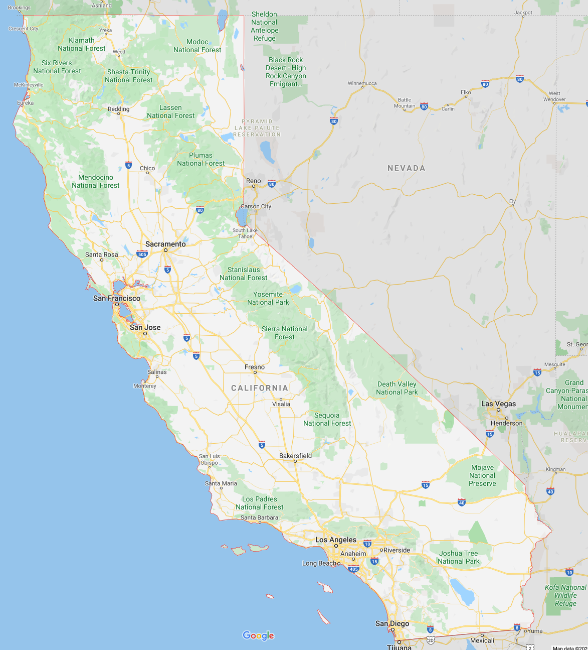
Figure: Satellite image of California from Google Maps.
Finally, we can also look at the median value of the houses in the two groups:
bins=50
fig, ax = plt.subplots(1,1, figsize=(10,5))
y.loc[left_group].hist(ax=ax, bins=bins, color='C0', alpha=0.5, label='Group 1')
y.loc[~left_group].hist(ax=ax, bins=bins, color='C1', alpha=0.5, label='Group 2')
plt.legend(loc='best')
plt.title('median value')
plt.show()

One observes that the median value is higher for the first group (Los Angeles & San Diego). However, the long tail in both groups is quite similar. So living seems to be more expensive for low and medium income people while for the upper class the prices seem to be comparable.
rmse_valid =[]
for i in tqdm(range(1, 18)):
    rf = RandomForestRegressor(n_estimators=100, max_features='sqrt', n_jobs=-1, random_state=42)

    results = cross_validate(rf, X_pca[:, :i], y, cv=5,
                             return_train_score=True,
                             scoring='neg_root_mean_squared_error')
    rmse_valid.append(-np.mean(results["test_score"]))
As an additional baseline we also create a median regressor:
rmse_median = rmse(y, [np.median(y)]*len(y))
Now we can plot the performances with the full Random Forest and the median regresssor as baselines for all subsets of components.
lineplot = sns.lineplot(np.arange(len(rmse_valid))+1 , rmse_valid, label='pca')
lineplot.axhline(rmse_median, c='y', linestyle='--', label='median')
lineplot.axhline(rmse_full, c='r', linestyle='--', label='full model')
plt.legend(loc='best')
plt.xlabel('number of PCA components')
plt.ylabel('RMSE')

So we can see that already with 4-7 principal components we get results that are quite close to the full model. As mentioned previously this has two advantages:
- Visualising 4 components is still hard but feasable compared to 17
- Training a Random Forest with half the features is twice as fast for training and inference.
Looking at the graph we see that there are several steep steps. It seems that adding these components improved the performance significantly. By taking the components with the biggest steps we can try to build a better selection of features:
features = [0,1,3,6,10]
rf = RandomForestRegressor(n_estimators=100, max_features='sqrt', n_jobs=-1, random_state=42)

results = cross_validate(rf, X_pca[:, features], y, cv=5,
                         return_train_score=True,
                         scoring='neg_root_mean_squared_error')
rmse_pca = -np.mean(results["test_score"])
rmse_pca
Just with 5 of 17 features we get <10% of the model that used all features. This model is 3-4 times faster to train and to make predictions. In practice there are more systematic ways of finding the best subset of features such as forward and backward selection (see link).
What is topology?
Topology is the mathematical field of shapes where one aims at measuring and categorising different bodies. One way to do this is to look at the number of holes an object has. In this regard a coffe mug is equivalent to a donut in the sense that the both have one hole. A deeper understanding of the shape of our dataset can help finding new interesting properties in our dataset. The Mapper algorithm aims at doing just that: within the unstructed datapoints in our dataset it finds links and clusters and helps us visualize them in two dimensional space. This is an exciting research area of the past few years with many applications.

Figure: A coffee mug is a donut.
Mapper overview
Mapper uses four steps to analyse the topological structure of a dataset. These four steps are:
Filtering/projecting: The high dimensional data is passed through a function (called the filter function) that transforms the data into a lower dimensional space. An xamples of such transformation is projecting onto an axis ($[x_1, x_2, x_3, \dots] \rightarrow [x_1]$). In general this could be any function that takes a vector and produces a vector of lower dimension.
Covering: Now this lower dimensional space is covered with intervals. It is important that these intervals should overlap a little as we will see when we go from clustering to constructing the network. In two dimensions such a cover could be overlapping square patches. These patches divide the dataset into subsets.
Clustering: Now we go back to the original space but keep the groupings from the covering. For each subset from the step before we now apply a clustering algorithm and store the clusters.
Constructing the topological network: Finally, we setup the topological network. To do so we create a node for each cluster we found in the previous step. Since we setup the patches such that they overlap one datapoint can be connected to two clusters. If that is the case we create a link between the two nodes of the cluster.
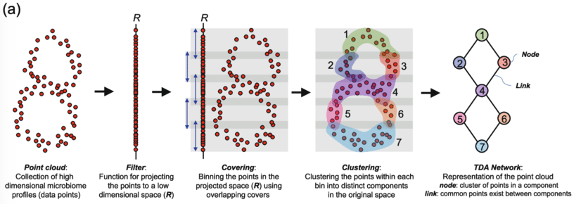
Figure: Schematic overview of Mapper [1].
[1] Liao, Tianhua & Wei, Yuchen & Luo, Mingjing & Zhao, Guo-Ping & Zhou, Haokui. (2019). tmap: an integrative framework based on topological data analysis for population-scale microbiome stratification and association studies. Genome Biology. 20. 10.1186/s13059-019-1871-4.
Giotto TDA
The application of topological methods to data is called topological data analysis (TDA). A Swiss company called L2F developed a scikit-learn comaptible library for TDA called giotto-tda and Lewis Tunstall is a core contributor. In the following section we will use giotto-tda to analyse a small toy dataset and give an some examples of interesting applications.
# TDA magic
from gtda.mapper import (
    CubicalCover,
    make_mapper_pipeline,
    Projection,
    plot_static_mapper_graph,
    plot_interactive_mapper_graph,
)
from gtda.mapper.utils.visualization import set_node_sizeref

# ML tools
from sklearn import datasets
from sklearn.cluster import DBSCAN
from sklearn.decomposition import PCA
def plot_cover(cover, ax, every_n=1):
    """Plot cover intervals."""
    x_interval = list([i,j] for i, j in zip(cover._coverers[0].left_limits_,cover._coverers[0].right_limits_))
    y_interval = list([i,j] for i, j in zip(cover._coverers[1].left_limits_, cover._coverers[1].right_limits_))

    normalize_interval(x_interval)
    normalize_interval(y_interval)

    plot_2d_intervals(x_interval, y_interval, ax, every_n=every_n)
def normalize_interval(interval, x_min=-1.2, x_max=1.2):
    """Clip all values in interval to x_min and x_max."""
    for i in range(len(interval)):
        interval[i][0] = min(max(interval[i][0], x_min), x_max)
        interval[i][1] = min(max(interval[i][1], x_min), x_max)
def plot_2d_intervals(x_intervals, y_intervals, ax, cmap_name='magma', every_n=1):
    """Plot a set of 2d-intervals with rectangular boxes."""
    cmap = mpl.cm.get_cmap(cmap_name)


    for i, x_inter in enumerate(x_intervals):
        for j, y_inter in enumerate(y_intervals):
            if (i+j)%every_n==0:
                origin = (x_inter[0], y_inter[0])
                width = x_inter[1]-x_inter[0]
                height = y_inter[1]-y_inter[0]
                #print(origin, width, height)
                rect = plt.Rectangle(origin, width, height, facecolor=cmap(np.random.rand()), alpha=0.5, edgecolor=None)
                ax.add_patch(rect)
data, _ = datasets.make_circles(n_samples=5000, noise=0.05, factor=0.3, random_state=42)
plt.figure(figsize=(10,10))
plt.scatter(data[:,0], data[:,1], c=np.random.rand(data.shape[0]), cmap='magma')
plt.show()

# Define filter function - can be any scikit-learn transformer
filter_func = Projection(columns=[0, 1])
cover = CubicalCover(n_intervals=10, overlap_frac=0.3)
cover.fit(data)
We can plot the patches on top of the dataset to see how they cover the space:
fig, ax = plt.subplots(figsize=(10,10))
plt.scatter(data[:,0], data[:,1], c='black', alpha=0.3)
plot_cover(cover, ax, every_n=1)
plt.show()

With so many overlapping patches it is a bit hard to see what is going on. Therefore, we can plot just every other patch to see how the patches actually look like:
fig, ax = plt.subplots(figsize=(10,10))
plt.scatter(data[:,0], data[:,1], c='black', alpha=0.3)
plot_cover(cover, ax, every_n=2)
plt.show()

We can see that the patches overlap the each other by about a third which is what we would expect based on the initial setting. On each patch we will now run a clustering algorithm.
Clustering
Before we can construct the graph we need to cluster each patch. In the previous lesson we learned about k-means which is a simple clustering algorithm, however one needs to specify the number of expected clusters. There is another powerful clustering algorithm that does not require that parameter since it only works with density, called Density-based spatial clustering of applications with noise (DBSCAN).
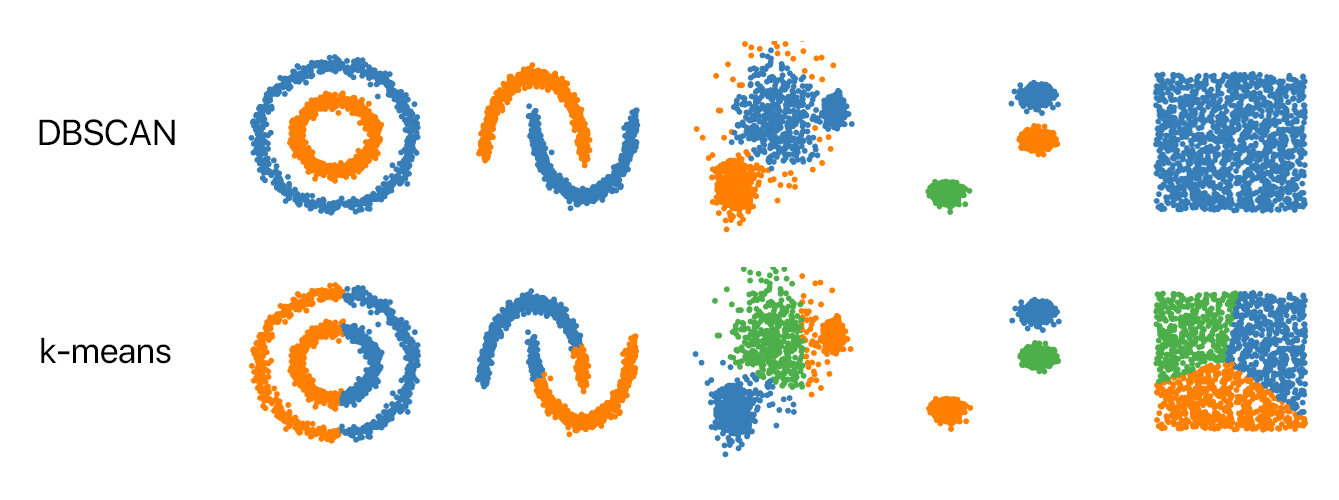
Figure reference: https://github.com/NSHipster/DBSCAN
The algorithm for DBSCAN is the following:
- Start with a point that is not part of a cluster.
- Find all neighbours that are within a distance less than R.
- If there at least n neighbours they build a cluster. Else the point is an outlier and go back to 1.
- For each new point in the cluster repeat 2 until you can't find any new connected points. Then go back 1.
- When all points are either in a cluster or outliers without enough neighbours you are done.
The maximal distance and minimal number of neighbours define a minimal density for a cluster, hence the name.
clusterer = DBSCAN()
pipe = make_mapper_pipeline(
    filter_func=filter_func,
    cover=cover,
    clusterer=clusterer,
    verbose=False,
    n_jobs=1,
)
Finally, we can visualise the results. We can see that the two rings were correctly reconstructed in the topological network
fig = plot_static_mapper_graph(pipe, data)
fig.show(config={'scrollZoom': True})
Application: Breast cancer
A team of biologist and mathematicians applied the Mapper algorithm to genomic breast cancer data. Looking at the topological structure of the data they found a before unknown subgroup of breast cancer. Patients with on the newly discovered branch called c-MYB+ show 100% survival rate without metastasis wheras the other branch is deadly. Clinicians can now use the discovered genetic profile to test patients and adapt the treatment accordingly. This highlights the impact modern data science can have on people's life.
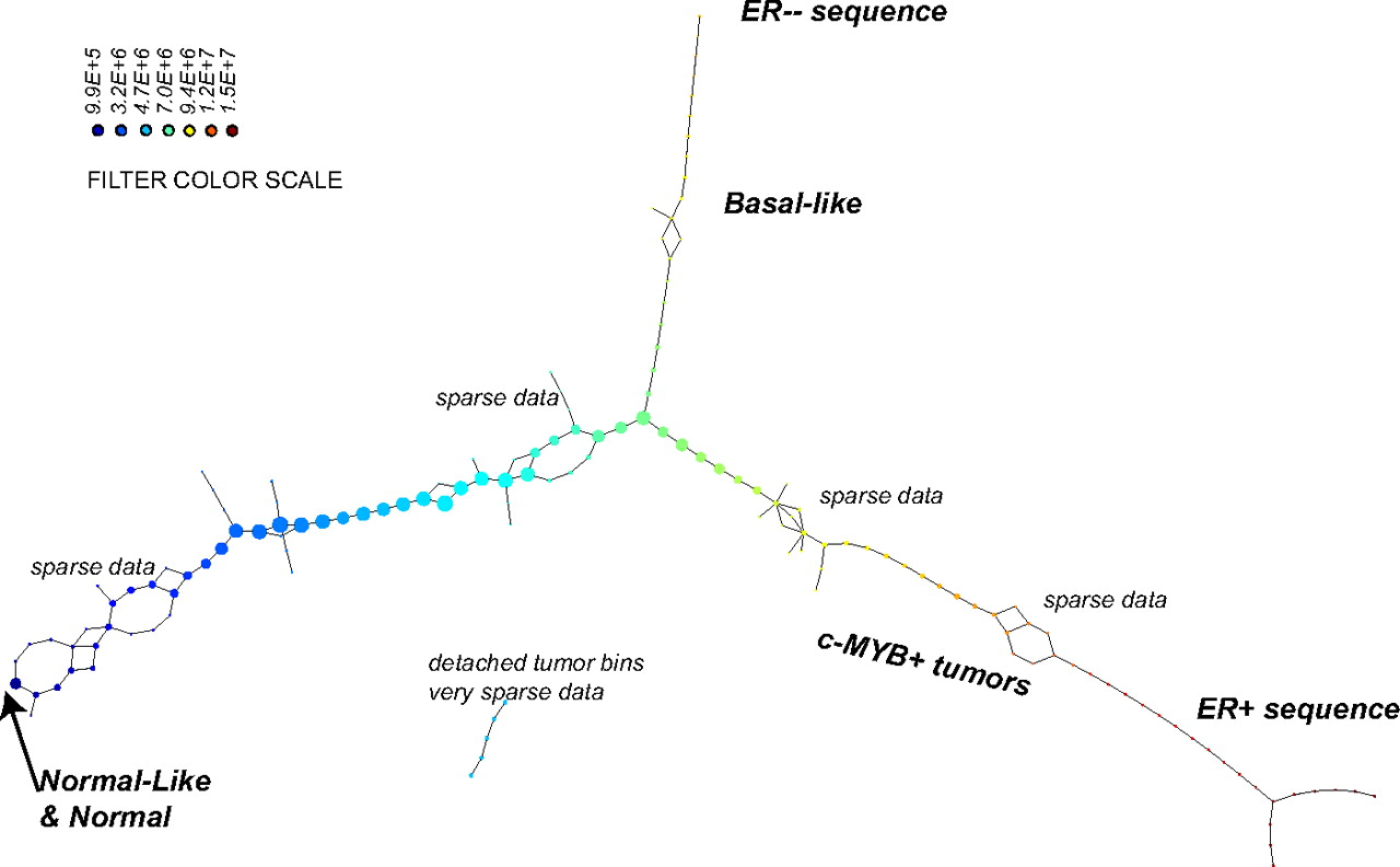
Figure: Mapper applied to breast cancer data.
Reference: Nicolau, Monica, Arnold J. Levine, and Gunnar Carlsson. "Topology based data analysis identifies a subgroup of breast cancers with a unique mutational profile and excellent survival." Proceedings of the National Academy of Sciences 108.17 (2011): 7265-7270.