![]()

- Gain an introduction to the
DataFramedata structure of the pandas library - Import CSV data into a pandas
DataFrame - Calculate descriptive statistics with pandas
- Generate histogram, scatter, and correlation plots with the seaborn library
- Chapter 2 of Hands-On Machine Learning with Scikit-Learn and TensorFlow by Aurèlien Geron.

Figure: Not a Python library.
pandas is one of the most popular Python libraries in data science and for good reasons. It provides high-level data structures and functions that are designed to make working with structured or tabular data fast, easy, and expressive. In particular, pandas provides fancy indexing capabilities that make it easy to reshape, slice and dice, perform aggregregations, and select subsets of data (and more!). Since data manipulation and cleaning are such important skills in data science, pandas will be one of the primary focuses in the first half of this module.
The two workhorse data structures of pandas are:
Series: a one-dimensional array-like object that contains a sequence of values and an associated array of data labels, called its index;DataFrame: a rectangular table of data that contains an ordered collection of column, each of which can be a different typ (numeric, string, boolean etc). It has both a row and a column index and can be thought of as adictofSeriesall sharing the same index.
As a rough idea, you can think of DataFrame objects as "tables" and Series objects as vectors or columns of a table. (The analogy isn't perfect because you can actually use DataFrame objects to represent higher dimensional data using hierarchical indexing; we will learn about this later in the module.) A graphical representation of these data structures is shown in the figure below.
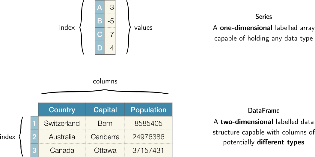
Figure: Graphical representation of the Series and DataFrame objects in pandas.
Throughout this module, we will use the following import statement for pandas
import pandas as pd
which is the accepted convention in the community. Thus whenever you see pd in code, you know it's referring to pandas.
To use any Python library in your code you first have to make it accessible, i.e. you have to import it. For example, executing
current_time = datetime.datetime.now()
in a cell block will return NameError: name 'datetime' is not defined. Evidently native Python doesn't know what datetime means. In general, for any object to be defined, it has to be accessible within the current scope, namely:
- It belongs to Python's default environment. These are the in-built functions and containers we saw in lesson 1, e.g.
str,print,listetc. - It has been defined in the current program, e.g. when you create a custom function with the
defkeyword. - It exists as a separate libary and you imported the library with a suitable
importstatement.
Item (3) explains why datetime was not defined: it is a separate library that must be imported before we can access its functionality. Thus the solution to our error above is to execute
import datetime
current_time = datetime.datetime.now()
current_time.isoformat()
which should return a datetime string in ISO format like '2019-02-24T13:15:33.512181'. See this article for a nice summary about imports and what scope means in the context of Python.
# reload modules before executing user code
%load_ext autoreload
# reload all modules every time before executing Python code
%autoreload 2
# render plots in notebook
%matplotlib inline
# data wrangling
import pandas as pd
from pathlib import Path
from dslectures.core import get_dataset

# data viz
import matplotlib.pyplot as plt
import seaborn as sns

sns.set(color_codes=True)
sns.set_palette(sns.color_palette("muted"))
You should know
In addition to the standard data science libraries, we have also imported Python's pathlib module since it provides an object oriented interface to the file system that is intuitive and platform independent (i.e. it works equally well with Windows, mac OS, or Unix/Linux). See this article for a nice overview of what pathlib is and why it's awesome.
To get warmed up, we will use the California Housing dataset, which contains 10 explanatory variables describing aspects of residential homes in California from the 1990s. The goal will be to read the data using pandas and use the library's functions to extract descriptive statistics in a fast manner.
First we need to fetch the dataset from Google Drive - we can do that by running the following function:
get_dataset('housing.csv')
To load our dataset we need to tell pandas where to look for it. First, lets have a look at what we have in the data/ directory:
DATA = Path('../data/')
!ls {DATA}
You should know
Starting a line in a Jupyter notebook with an exclamation point !, or bang, tells Jupyter to execute everything after the bang in the system shell. This means you can delete files, change directories, or execute any other process.
A very powerful aspect of bangs is that the output of a shell command can be assigned to a variable! For example:
contents = !ls {DATA}
contents
directory = !pwd
directory
With pathlib it is a simple matter to define the filepath to the housing dataset, and since the file is in CSV format we can load it as a pandas DataFrame as follows:
housing_data = pd.read_csv(DATA/'housing.csv')
This first thing we recommend after creating a DataFrame is to inspect the first/last few rows to make sure there's no surprises in the data format that need to be dealt with. For example, one often finds metadata or aggregations at the end of Excel files, and this can cause problems if not handled correctly.
The DataFrame.head method displays the first five rows of a DataFrame:
housing_data.head()
If we want to see more rows, we just pass an integer argument to the method as follows:
housing_data.head(10)
housing_data.tail()
# random_state is the seed for the random number generator
housing_data.sample(n=5, random_state=42)
housing_data.info()
We see there are 20,640 rows in the dataset and that the total_bedrooms column is missing values because it has less than 20,640 non-null values. We also see that ocean_proximity is of object type, which suggests it is a str - to see how many districts belong to each category we can use the DataFrame.value_counts method:
housing_data['ocean_proximity'].value_counts()
Another way to get a summary of the numerical attributes is via the DataFrame.describe method:
housing_data.describe()
In some cases, we want to explicitly calculate descriptive statistics of a single column. For example, the mean and median house age can be calculated as follows:
mean, median = housing_data['housing_median_age'].mean(), housing_data['housing_median_age'].median()

print(f'The housing median age mean is {mean:.2f} years, while the median is {median} years')
Another quick way to get a feel for the type of numeric data that you are dealing with is to plot one or more of the following:
- Histograms: shows the number of instances (on the vertical axis) that have a given value range (on the horizontal axis). Useful for understanding the shape of a single variable.
- Correlation matrix heatmap: shows how much each column correlates with each other column with a color gradient. Useful for quickly seeing which variables correlate most strongly with the variable of interest.
- Scatter plots: shows a collection of points, each having the value of one column determining the position on the horizontal axis and the value of the other column determining the position on the vertical axis. Useful for visually looking for correlations.
To create these plots we will use the seaborn data visualisation library. In the same way the pd is the accepted alias for pandas, one use sns as the alias for seaborn.
Histograms are one of the most simple, yet powerful types of data visualisation. They can quickly tell us which values are most frequent, whether there are outliers and more. To create a histogram in seaborn, we can use the seaborn.distplot method which expects a Series object with no missing values.
# we append a semi-colon ; to suppress some metadata from the plot
sns.distplot(housing_data['housing_median_age'], kde=False);

From this plot we can see a few of the values that we previously calculated. For example we see that the maximum value of housing age is about 50 years and that the most frequent value is around 30 years. Curiously, there is a second peak around 15 years - why might that be the case? Asking these types of questions is often the first step in any exploratory data analysis.
To create the heatmap, we first need to calculate the correlation matrix of our numerical columns.
correlation_matrix = housing_data.corr()
We can examine why attributes correlate most strongly with the median house value, which will be the quantity we wish to predict when we start building models:
correlation_matrix['median_house_value'].sort_values(ascending=False)
Let's now build our heatmap! By default, seaborn uses strong positive correlations are shown in lighter shades:
sns.heatmap(correlation_matrix, annot=True, fmt='.2f', linewidths=1);

You should know
Whenever you hear the word "correlation", most people are usually referring to the standard correlation coefficient $\rho_{X,Y}$ (also called Pearson's r) between a pair of random variables $X$ and $Y$:
$$ \rho_{X,Y} = \frac{\mathrm{cov}(X,Y)}{\sigma_X\sigma_Y} \,,$$
where $\sigma_{X,Y}$ is the standard deviation of $X,Y$ and $\mathrm{cov}$ is the covariance. This coefficient ranges from -1 to 1; when it is close to 1 (-1) it means there is a strong positive (negative) correlation. When the coefficient is close to 0 it means there is no linear correlation. The figure below show various plots along with the correlation coefficient between their horizontal and vertical axes.
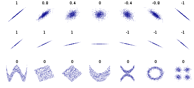
Figure: Standard correlation coefficient of various datasets. (source: Wikipedia)
Finally, another way to check for correlations is to examine the scatter plots of each numeric column. This can be useful for detecting non-linear correlations which might be missed in the analysis above. Seaborn provides a handy seaborn.pairplot function that allows us to quicky see the relationships between the numeric data:
attributes = ["median_house_value", "median_income", "total_rooms", "housing_median_age"]
sns.pairplot(housing_data[attributes].dropna());

In many cases, a scatter plot can be too dense to interpret because there are many overlapping points. For such scenarios, hexagon bin plots are very useful since they bin the spatial area of the chart and the intensity of a hexagon's color can be interpreted as points being more concentrated in this area. Let's make such a plot for the median_income and median_house_value variables using the seaborn.jointplot function:
sns.jointplot('median_income', 'median_house_value', data=housing_data, kind='hex');

Exercise #3
Why do you think we see a horizontal line at around $500,000?
Exercise #4
Visit the seaborn website and explore the available plotting functions and apply them to attributes in the housing dataset.